Arts organisations, publishers, festivals and heritage bodies. Work that rewards a close read and still holds up from across the street.
Culture is where our love of type and print gets the most room. We’ve built the identity for a national centenary programme, designed books you can’t buy anywhere else, and rebuilt archives so they’re open to everyone. A lot of it starts with a custom typeface.
See the workHow it tends to go
-
01
Type first.
When an organisation needs a voice of its own, we often draw it. Royal Sites of Ireland, Moving Objects and This Is Art! all have letters made for them. It’s the most durable thing we can hand over.
-
02
Made to be held.
Cloth bindings, cherry-wood boxes, signed prints taped to covers. With Driftwood Editions, Rich Gilligan and Noel Bowler, the object is part of the idea.
-
03
Open by default.
Cultural sites have to work for everyone. We build to exceed accessibility standards, bilingually where it matters, on a CMS your team can actually run.
Case studies
8 in depth · 17 more further down
1916 Centenary
Identity, publication and a bilingual digital platform for the national centenary programme.
Identity, Digital
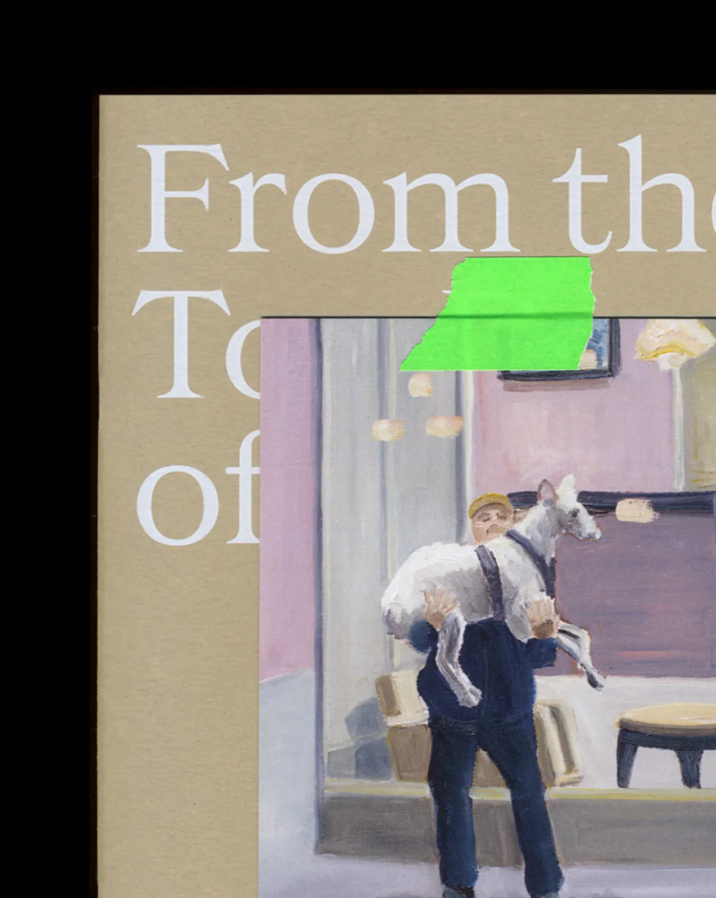
From the Top Deck of the Bus
Carl Hickey’s paintings of Dublin, published with a signed print taped to the cover of every copy.
Irish Arts Center
A rebrand for the home of Irish arts in New York.
Identity, Digital, Print, Packaging
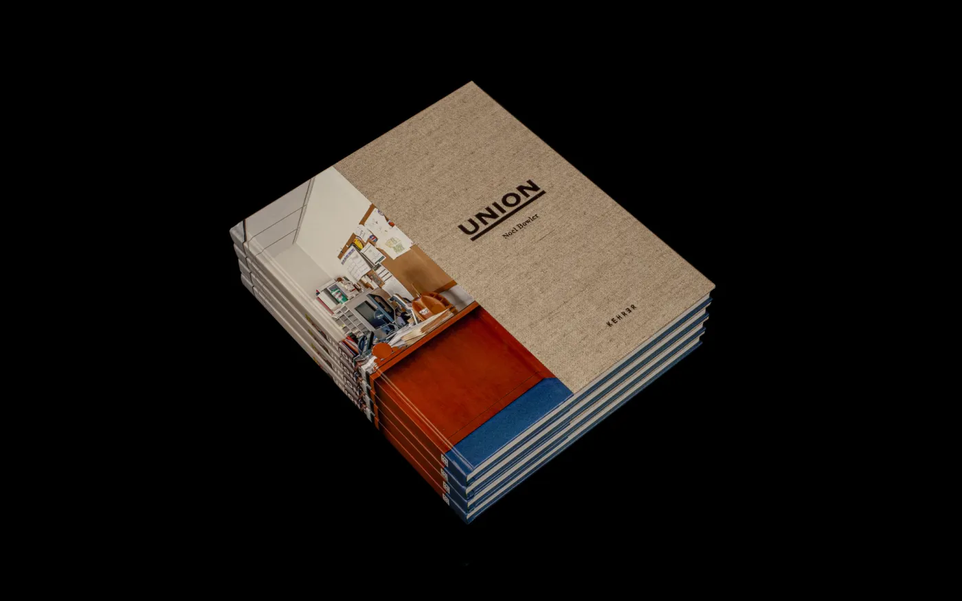
Noel Bowler - Union
Noel Bowler’s photographs of Ireland’s union halls, bound and boxed in cherry wood.
Royal Sites of Ireland
Six ancient ceremonial landscapes, one UNESCO nomination. Brand, custom typeface, iconography and website.
Identity, Type Design, Digital, Print
Pallas Projects
Twenty-plus years of an artist-run space’s archive, rebuilt as an accessible website.
Digital, Development
Entangled Life
An eight-month programme on climate and ecology. Identity, print and a custom web tool.
Identity, Print, Digital
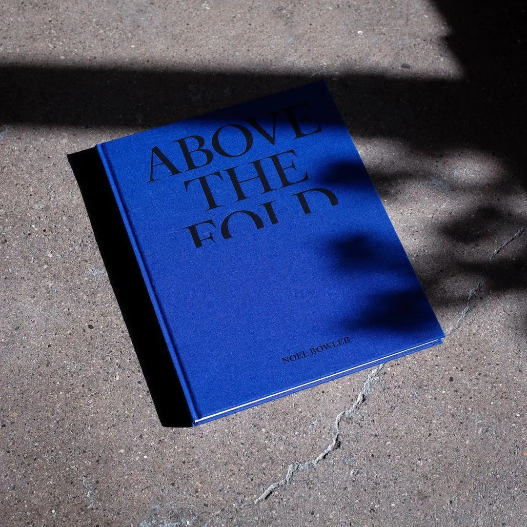
Noel Bowler – Above the Fold
A cloth-bound photobook for Noel Bowler.
Also on the shelf.
Moving Objects
Identity and custom type for the International Academy of Ceramics General Assembly in Dublin.
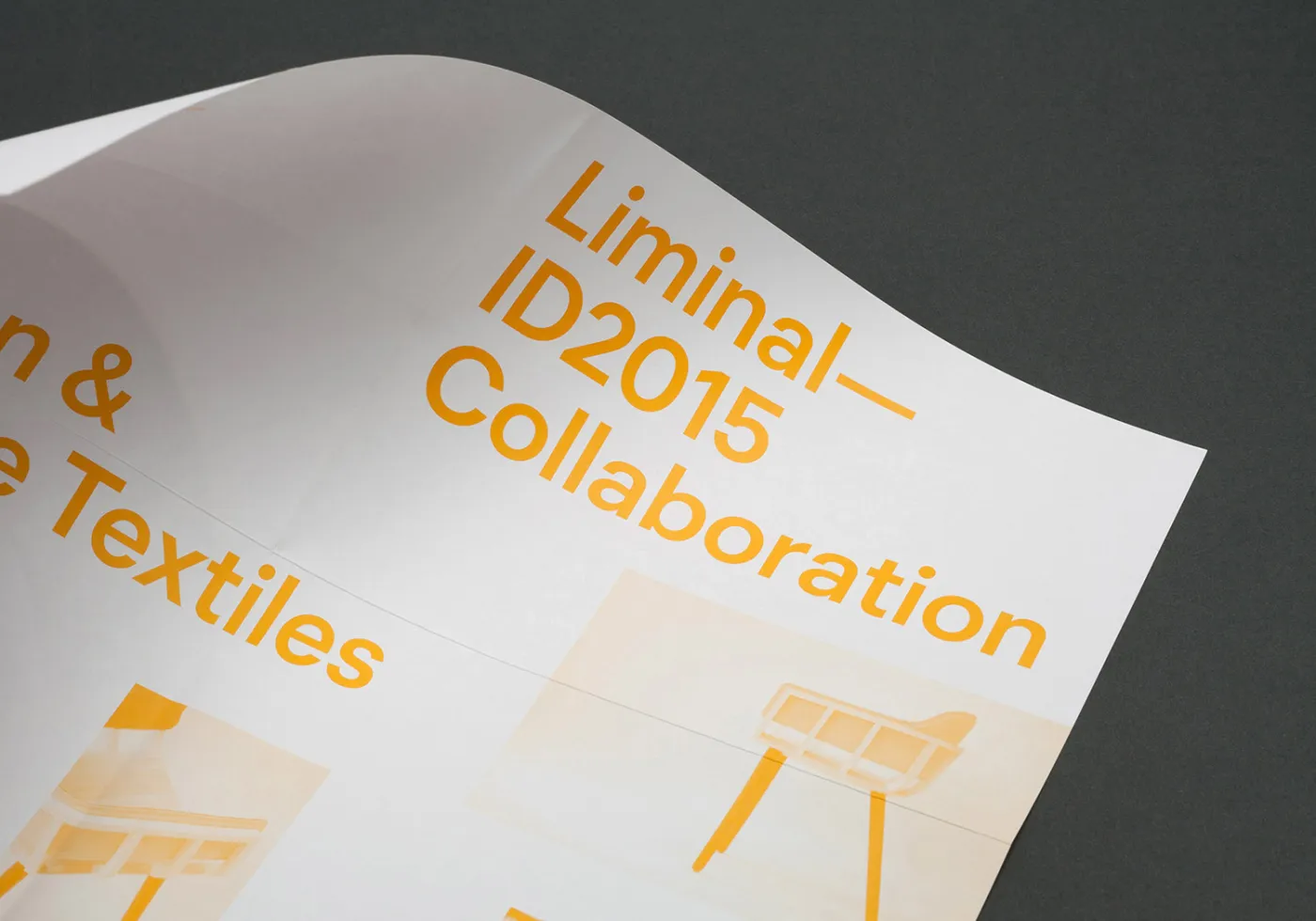
Liminal
Liminal, a touring exhibition of Irish design for ID2015.
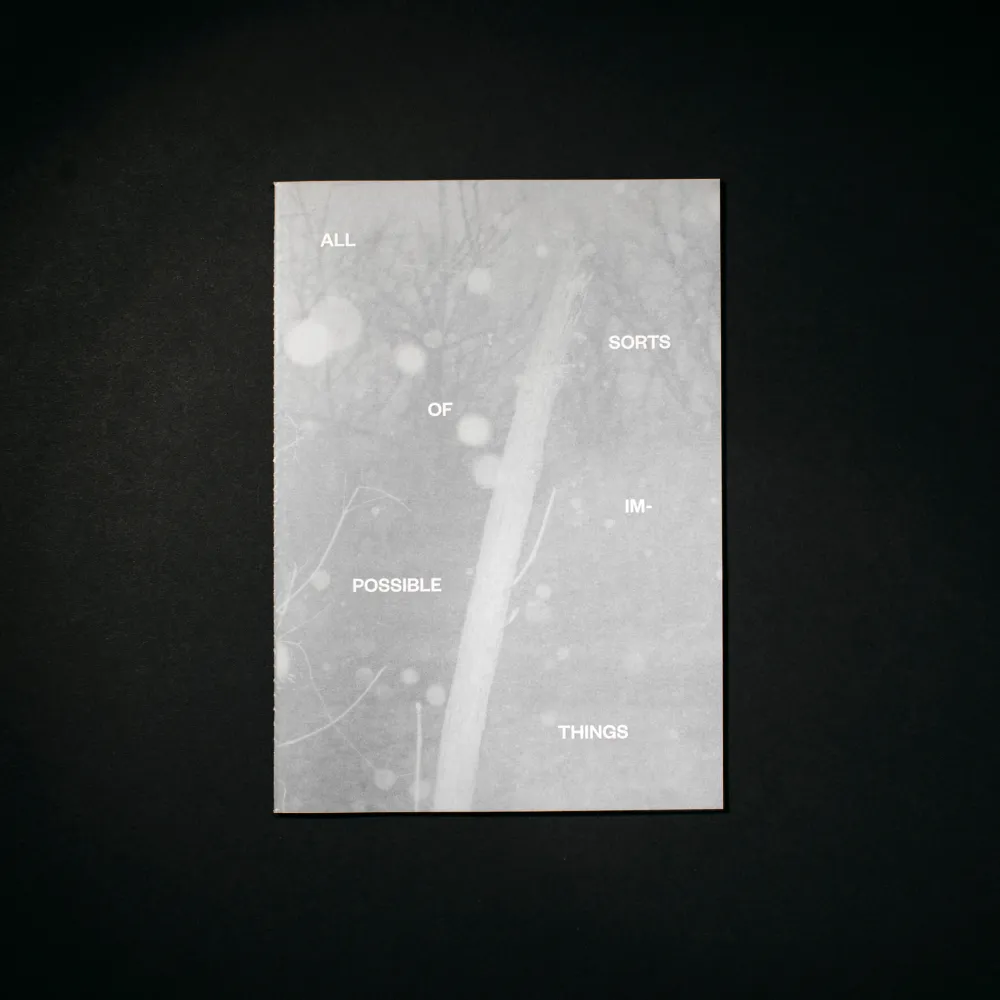
All Sorts of Impossible Things
A limited edition from Driftwood Editions, our publishing collaboration with photographer Rich Gilligan.
Mná100
Identity and website for Mná100.
Show & Tell
Identity and website.
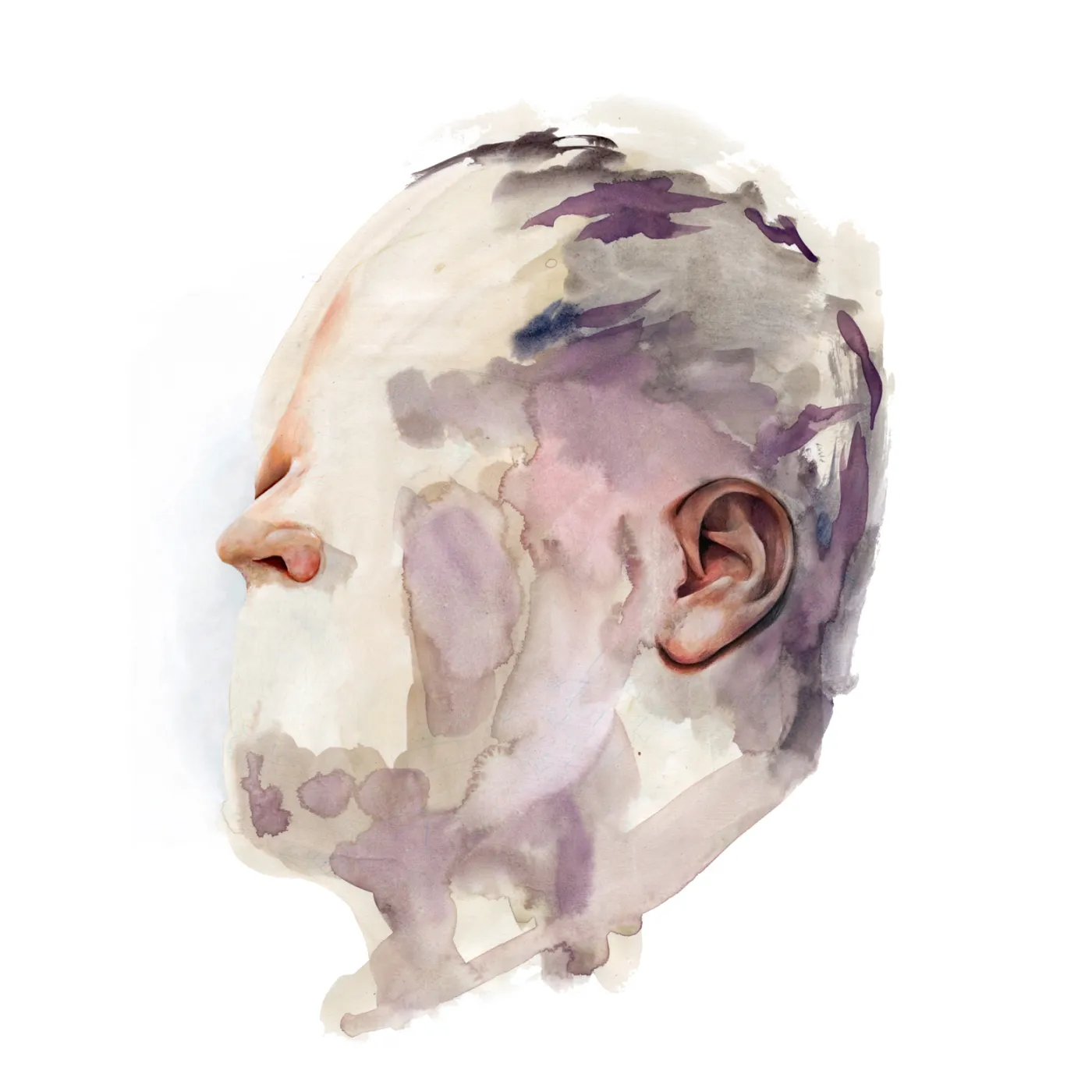
The Coronas – Time Stopped
Packaging and art direction for Time Stopped.
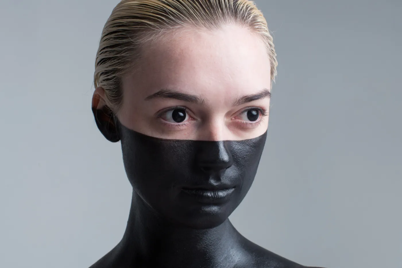
The Coronas – Trust The Wire
Album packaging and art direction for Trust The Wire.
Collective Films
Website for a film production company.
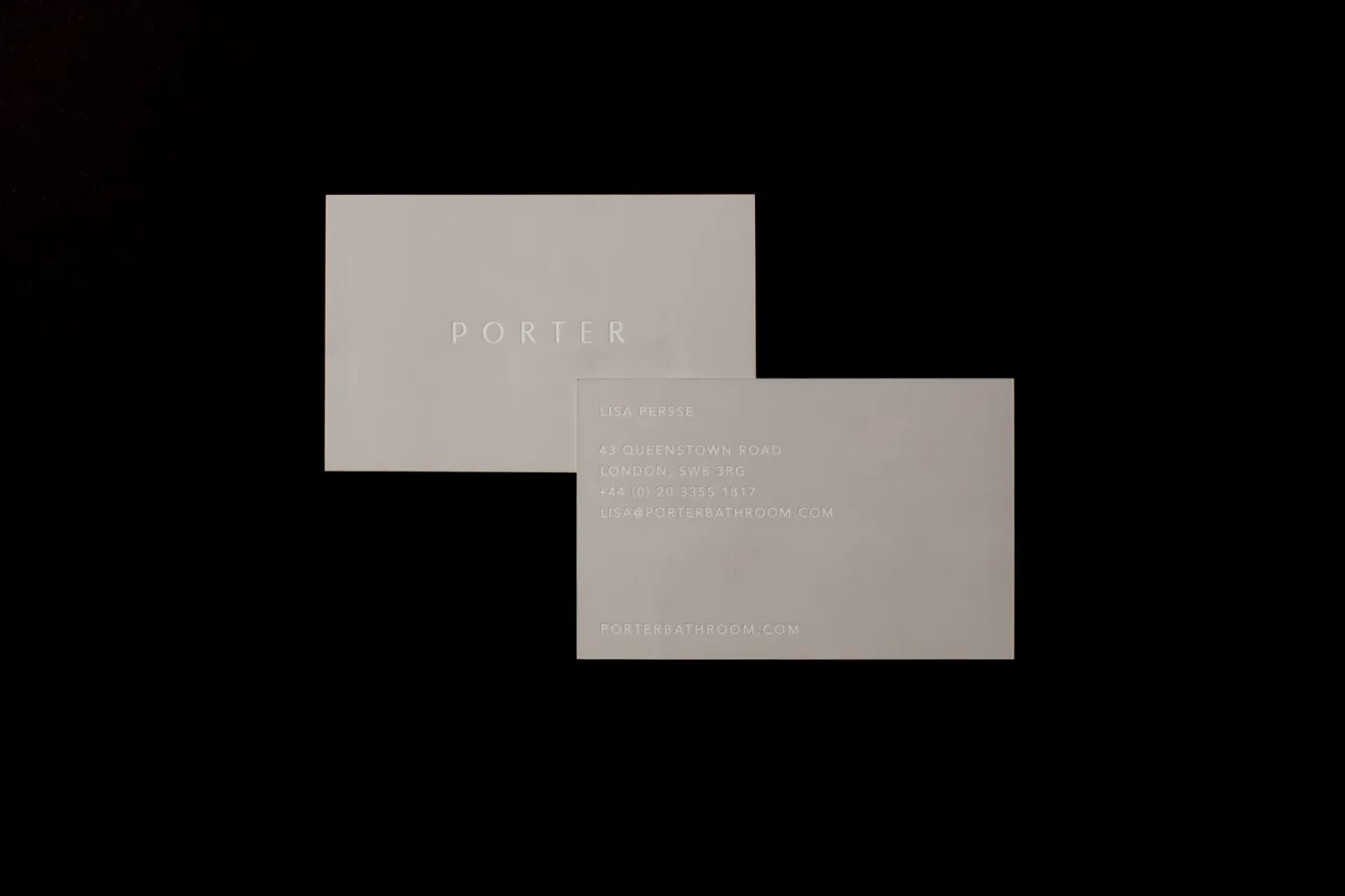
Porter
Print and art direction.
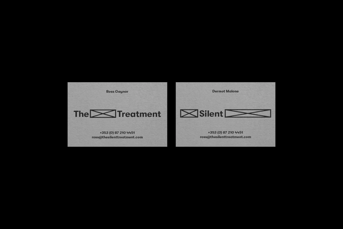
The Silent Treatment
Identity and print.
Peigi’s Adventures
Print, art direction and digital.
Abhainn / Hydro Methods
Dublin’s hidden rivers, walked with headphones. A website that doubles as a tape sign-out ledger, and a printed map for the route.
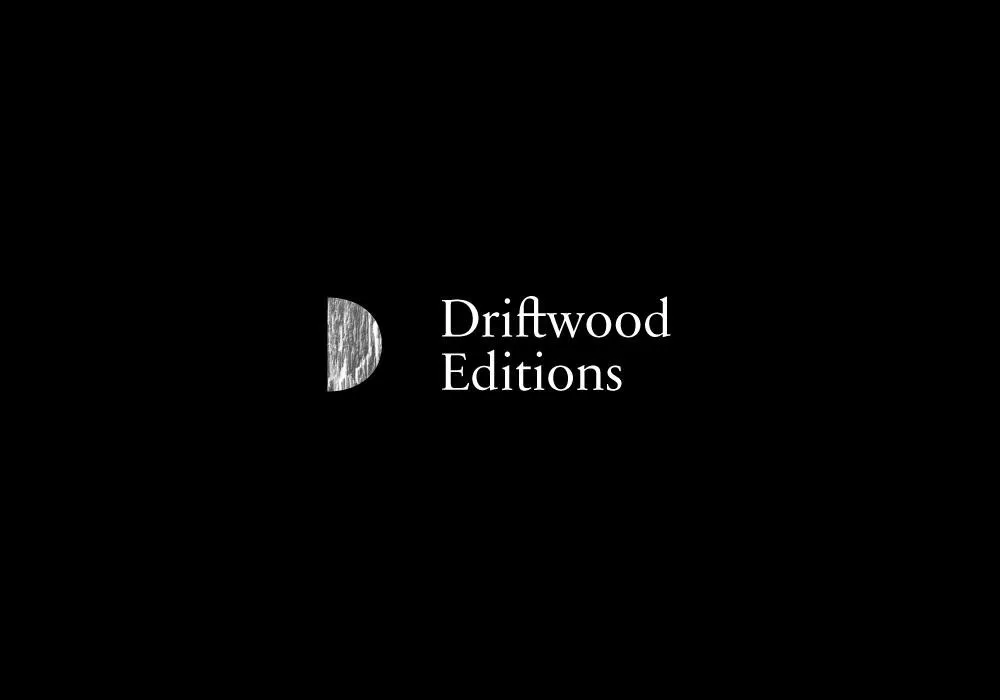
Driftwood Editions
A ‘D’ printed from a block of driftwood, a first book, and a web shop for prints — the start of our publishing run with Rich Gilligan.
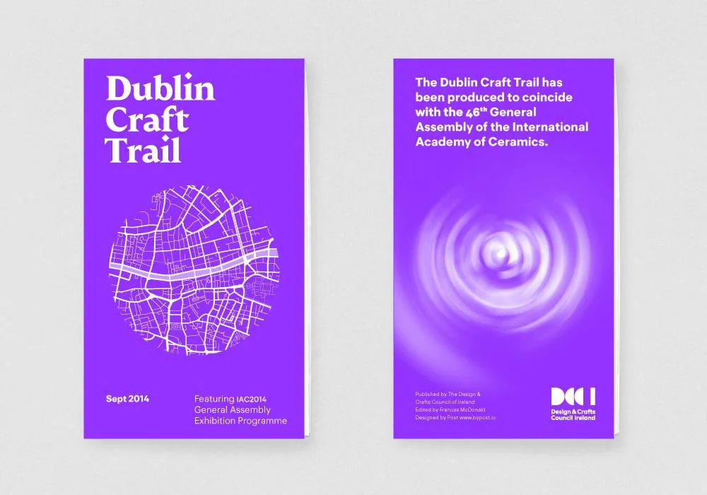
Dublin Craft Trail
We learned cartography for this one: a walking map of Dublin’s makers, with landmark drawings and window vinyls.
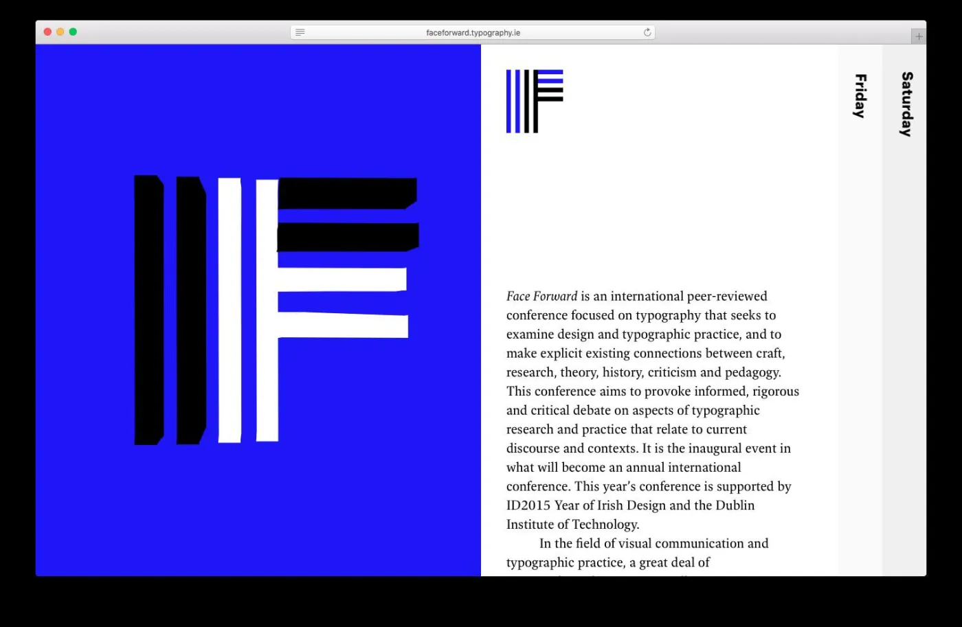
Face Forward
An interactive website for Ireland’s first international typography conference.
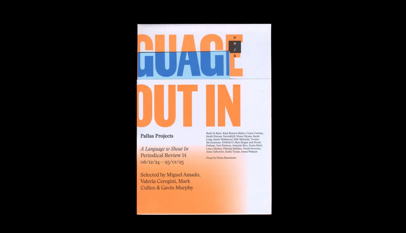
Periodical Review 14
A display typeface drawn for the edition and a fluorescent Pantone, for a long-running review of Irish art.
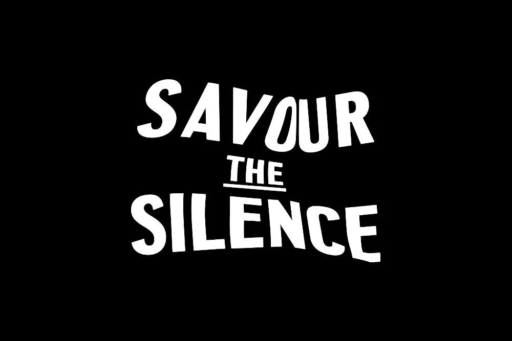
Taylorfest
Posters for a silent-film festival, set like title cards projected onto a bedsheet.